Last week I shared a few clips of Typogram:


To provide you a little context, we incorporated eight tried-and-true logo design methods in Typogram; the video clips from last week showcased two of them: Font Style Mashup (for Duane Reade) and Irregular Letter (for Desigual). What are the other six methods?
One of the unrevealed Typogram design methods is called “Letter Icon Swap.” During our software pilot programs with early customers, I found the most picked method is Letter Icon Swap; it is also my favorite design trick to share.
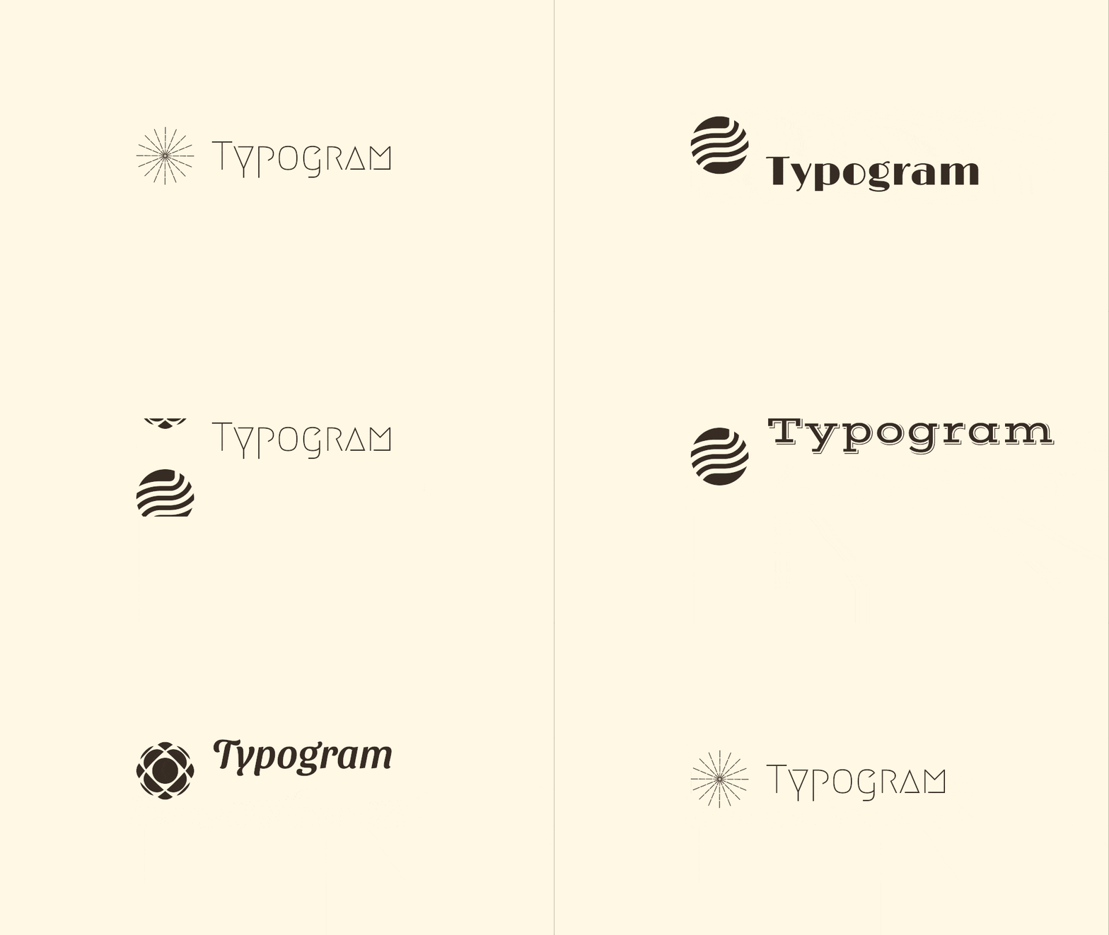
A lot of logo generators use this logo template: icon on the left, brand name text on the right:

The problem I see in it is that the icon is not custom-designed. It is from an icon library, and anyone could also choose that. Icon from a library also gives a generic look because it was designed with no specific context or usage in mind; simply pairing it up with the brand name side-by-side makes an easily forgettable logo.
We are not opposed to incorporating icons in logos. The icons just need to be either
a) custom-designed, most likely by professionals, which is not friendly for budget-tight entrepreneurs,
or b) incorporated in a unique way, which is the Letter Icon Swap method.
Letter Icon Swap is to swap out a letter or a part of the letter with an icon. Taking the easily recognizable Tinder logo for an example, they swap the dot of the letter “i” with a fire icon. See how Letter Icon Swap works in action using Typogram:

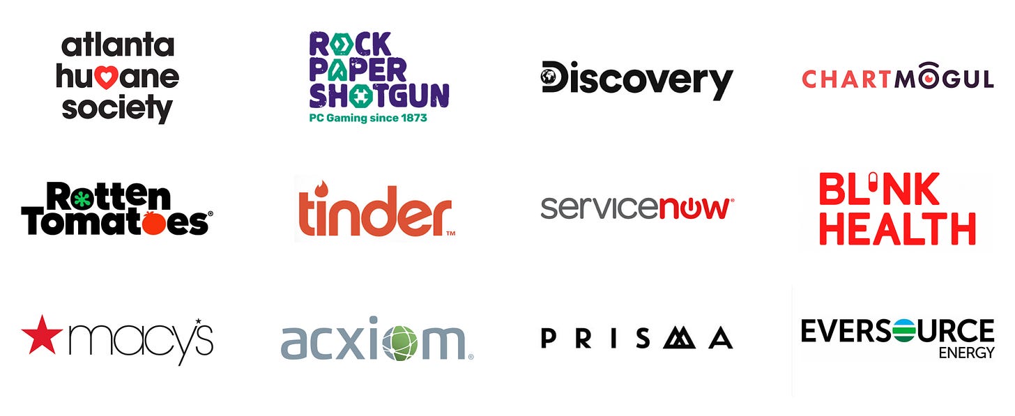
The Letter Icon Swap is one of the best-kept secrets among professional brand designers. If you analyze thousands of logos as I did, you notice that they are frequently featured in successful brands:
On top of having a star icon to the left, Macy also replaced the apostrophe with the star icon to make sure the logo’s uniqueness

The beauty of this method is that the icon can be any generic icon from a library; the uniqueness is guaranteed by the way you swap it with the letterform.
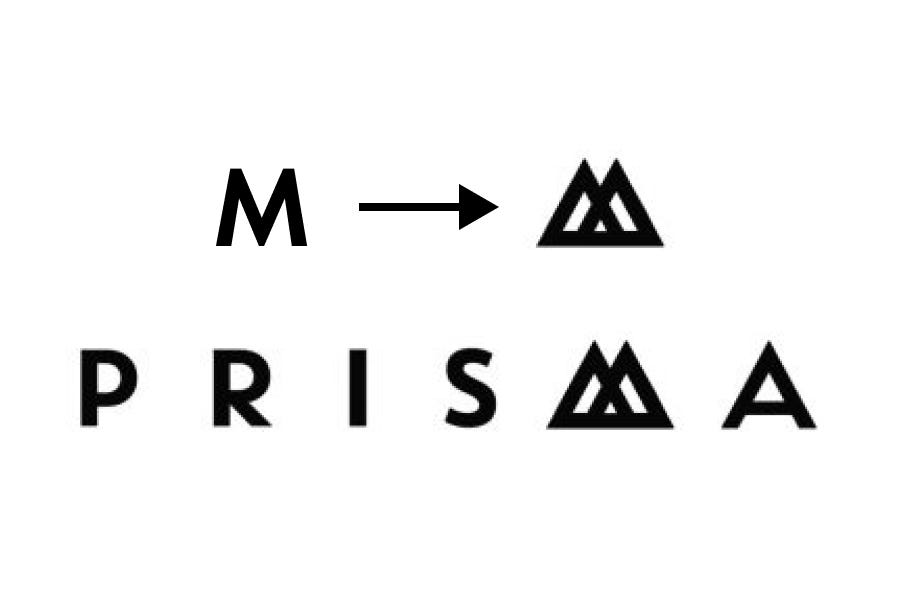
One thing to keep an eye on is to make sure the brand name still reads easily afterward. It is easier to retain legibility when we swap the round and square shapes with icons, like the letter o, the dot of the i, j, and the counter (or the donut hole) of a, b, d, g, o, p, q. With other letters, always swap the letterform with an icon in a similar shape, such as the letter M and a mountain icon with two peaks:

Open Call
If you are an entrepreneur who feels adventurous, send me what your startup is, and I will mock up a new logo utilizing the Letter Icon Swap method! Your startup also gets a free shout-out in my newsletter when I share the logo mockup in upcoming issues!
❧
See you next week! If you have friends who are interested in founding startups, please consider sharing my newsletter with them!
If you enjoy this series, you can subscribe here:

