I'm Hua, a designer and bootstrapping founder building Typogram, a brand design tool. As part of running Typogram, I create this digestible weekly guide with fonts, colors, and design ideas to help founders, creators, and makers step up their game in marketing and get creative!
Hi Everyone 👋
I hope you had a restful weekend! This week we continue with our branding series. I had fun writing this post, let me know what you think!
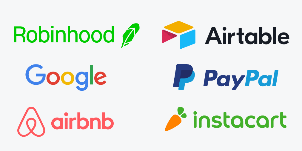
In the last post, we talked about commonalities found in luxury fashion brands. This time, we’ll turn our attention to the brandings of startups and tech companies. Find a couple of tech companies or start logos and branding around you, you’ll notice that they are sporting similar looks. Oftentimes, it is a friendly sans serif with brightly colored illustrations. Sounds familiar?
In this post, we’ll attempt to find some reasons that explain this trend.

Trust at First Sight
Since the 2010s, consumers are becoming increasingly more educated about issues like data security and user privacy. Over time, they feel more and more uneasy and distrustful regarding tech companies. According to KPMG,
A full 86% of the respondents said they feel a growing concern about data privacy, while 78% expressed fears about the amount of data being collected. Some 40% of the consumers surveyed don't trust companies to use their data ethically, and 13% don't even trust their own employers. source
This uneasiness didn't occur overnight. It was a chronic issue that became more painful as more scandals about data abuse and privacy infringement broke out in the last decade. Many consumers are more reluctant to try new products and tech. I know I am, and I'm not alone.
Therefore, it became essential for tech companies to show they are friendly and cheerful — an important way to make a good impression and gain users' trust. Many tech companies choose humanist or geometric sans serifs to communicate these tones, a bright color palette, cheerful illustrations, and quirky animations. Since there is already mistrust, it is more important than ever to have trust at first sight.
Here are a few quotes from startups and tech companies themselves to illustrate the importance of being friendly and delightful.

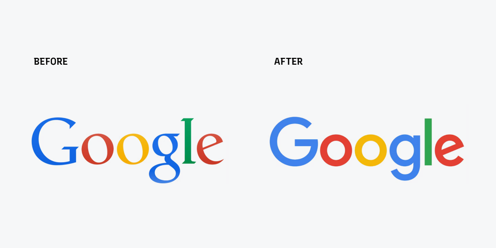
Google on their rebranding logo, 2015
We think we’ve taken the best of Google (simple, uncluttered, colorful, friendly), and recast it not just for the Google of today, but for the Google of the future. source

Robinhood on introducing new illustration styles and typefaces as part of their rebrand, 2020
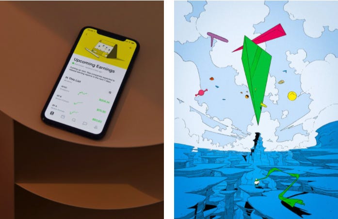
A new illustration style: delightful and future-focused. Two new typefaces: Capsule Sans, a warm, highly legible sans serif embodying simplicity and precision; and Nib, a unique, welcoming, and whimsical serif full of personality. source
Know someone who might like this post? Share it with a friend. That would make my day!
Branding Defined by User Experience
Since the 2010s, branding is increasingly designed around user experience. The arrival of smartphones introduced a groundbreaking idea: a product can exist in multiple workspaces, most conveniently, on our phones. Startup branding and user experience had now been tied more than ever.
By being a completely different device with a new interaction model, the mobile platform made designing a product more complex. People use the product and interact with the brand at screens much smaller than desktops. Companies must think about user experience across different devices when it comes to how consumers experience their brands.
Google on their rebranding, 2015
...You expect Google to help you whenever and wherever you need it, whether it’s on your mobile phone, TV, watch, the dashboard in your car, and yes, even a desktop! source
Robinhood on their rebranding, 2020
A bold evolution of our brand — an inspiring and imaginative new visual identity — to complement the interface you love from your Robinhood account. source
Mobile awareness made startups and tech companies favor simple sans serif wordmark logos, which is way more screen-friendly due to better readability. Sans serif has simpler letter shapes from lack of serifs and stroke contrasts than its serif counterpart or a logo with ornate iconography.
Parallel Between History of Sans Serif & Brand Visions
Lastly, there is an interesting parallel between the history of sans serif and the Brand visions offered by startup and tech companies.
When sans serif typefaces first came around, people hated how they looked compared to the more classic calligraphy-inspired serifs. They eliminated the serif's ornate, elegant letter shapes and preferred straight lines and simpler forms. They were considered ugly( remember grotesque sans serif?).
What sans serif stands for — simplicity and reduction— match what most tech companies promise: better, more efficient results through a simplified process that significantly improves the original (traditional) methods. This is perhaps one of the key reasons why many agencies love to use sans serif for tech rebrands in addition to user experience and a "friendly" brand image.
Cross Pollinating Between Industries
Is it possible that this trend comes from fashion companies?
As noted in our previous post, fashion companies are also rebranding to sans serif. Is it possible that tech companies looked to fashion industries for some tips on how to elevate their brand images and give it a hip makeover? I think it’s very likely.
If you enjoy this series, you can subscribe here:
Have more questions about design and fonts? Please email me hua@typogram.co or find me on Twitter at @HuaTweets. You can also read the past issues on Typogram's blog.

