

FontDiscovery 🖼️ 57: Uncover Luxury Brand Logos: How to Create a Luxury Brand
Quick looks at what luxury brand logos have in common

I'm Hua, a designer and bootstrapping founder building Typogram, a brand design tool. As part of running Typogram, I create this digestible weekly guide with fonts, colors, and design ideas to help founders, creators, and makers step up their game in marketing and get creative!
Hi Everyone 👋
Hope you had a wonderful weekend! This week, I wrote another post for our branding series. Enjoy this post about luxury brands. Would love to hear what you think!
What Makes a Luxury Brand?
Know someone who might like this post? Share it with a friend. That would make my day!
In this scene in American Psycho, the main character, Patrick Bateman, compares business cards with his wall street “friends.” They smiled begrudgingly as they each introduced the vast design details behind their finely crafted business cards. We hear about:
- The thickness of the card.
- Patterns on the paper stock.
- The specific font the card had used.
Why are Patrick and his friends fussing over simple business cards? It’s all because of how the business cards make them look in front of their peers. The business cards symbolize their personal brands and social statuses to the people around them.
Though Patrick Batemen’s is not making luxury product lines, one thing is clear: Luxury brands make customers feel elevated.
If you want to create a luxury brand, it is crucial to pinpoint the value proposition: what is the luxury, who wants it, and how to speak to that group. Then, you can figure out how to use design and visual language to communicate to that group.
Let’s look at a few fashion luxury brand logos case studies to learn how they have shaped their visuals to value propositions.
Use a High Contrast Serif
Burberry is a luxurious fashion brand. Its most well-recognized logo had an editorial-looking high contrast serif logo with an equestrian graphic, emphasizing its roots in traditions as a British luxury brand.
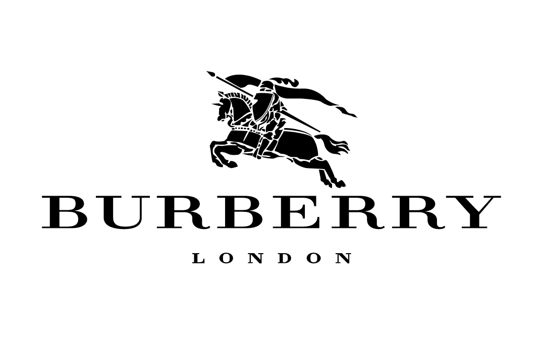
Serif typefaces are considered classic and traditional. High contrast serifs, like the one used in Burberry, are called modern serifs. Modern serifs are popular in editorial settings because their high contrast strokes have always been visually pleasing and elegant on glossy, large-format publications. They were great for advertisements and naturally became popular among fashion brands ( More about modern serifs in this post).
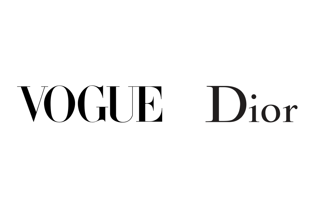
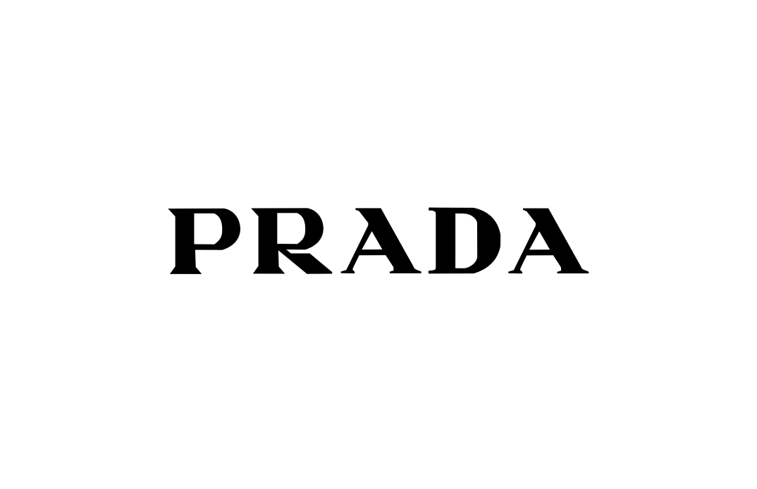
Modern Serif is a popular choice for luxury brands to communicate their connection to couture, elegance, and the editorial world. High contrast serifs can be combined with another visual element to create additional flares that give a brand extra pizzaz. The Prada logo uses high contrast serif with more angles and sharpness in the letterforms, giving a hint of edginess in its brand DNA. (Fun fact, Prada started as a leather store).
Know someone who might like this post? Share it with a friend. That would make my day!
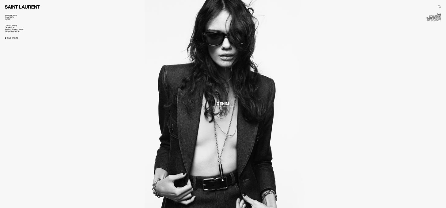
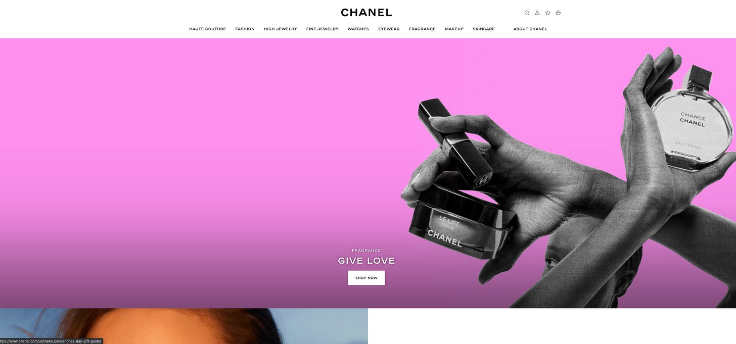
Think about White Spaces
On most luxury brand websites, you’ll notice one thing: vast amounts of white spaces.
Space is luxury.
When visiting a gallery, expensive paintings are hung far apart on white walls. The more physical spaces you have when buying a home, the more expensive the price tag is.
White space is a common technique used in luxury branding for logos and websites. Looking at logos and the websites of fashion brands, you will notice that there are large amounts of white spaces. Having less is having more - more room to emphasize and elevate the message, brand, and products.
source: ysl website
source: chanel website
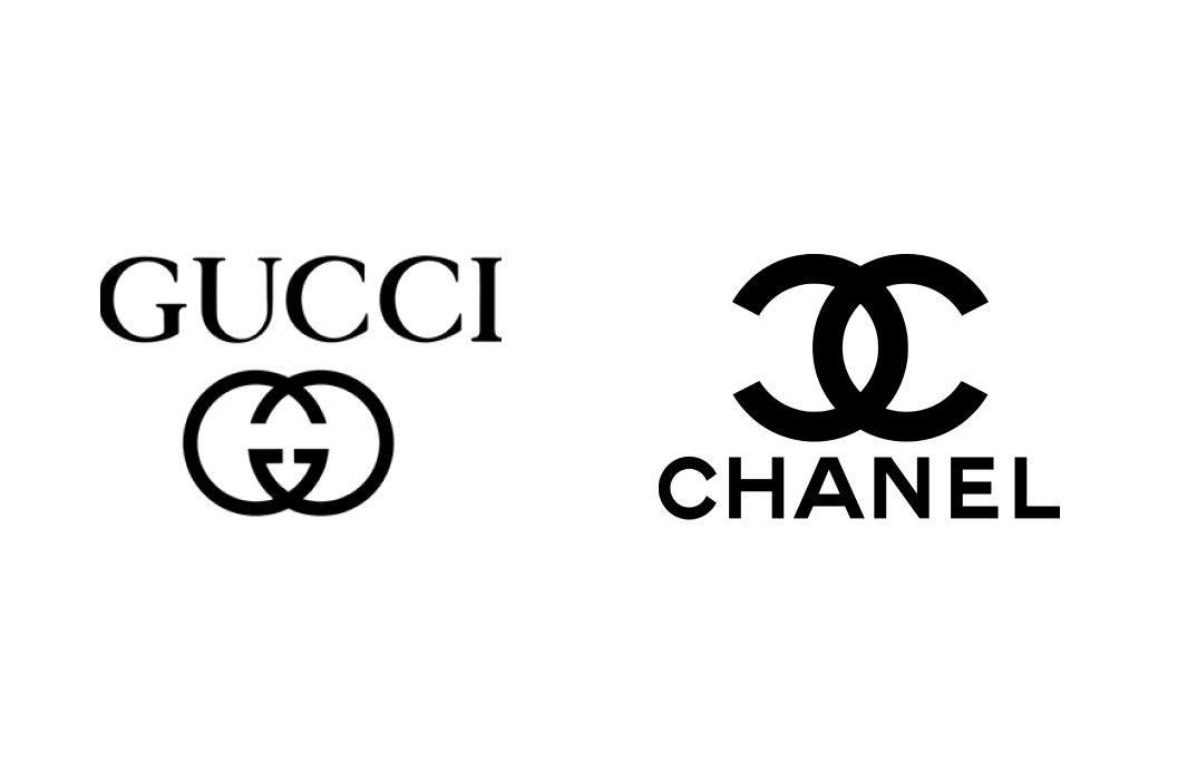
Is Monogram Right for You?
Another common theme that emerges across luxury brands is the use of monograms. Monograms are combinations of letters or characters in names.
As signatures representing authority and status throughout history, monograms were used for official insignia and royal emblems. The earliest monogram was found on Greek Coins, appearing as early as 350 BC.
img: Monogram of artist Albert Durer
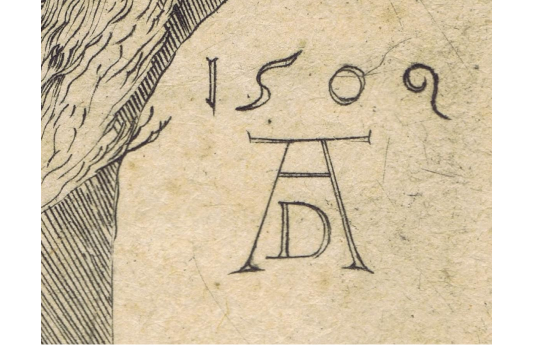
Many luxury brand logos with monograms, like Coco Chanel and Gucci, started as a family business, owning one local shop. Using monograms in their brands implied the luxury experiences and the statuses offered and represented.
Know someone who might like this post? Share it with a friend. That would make my day!
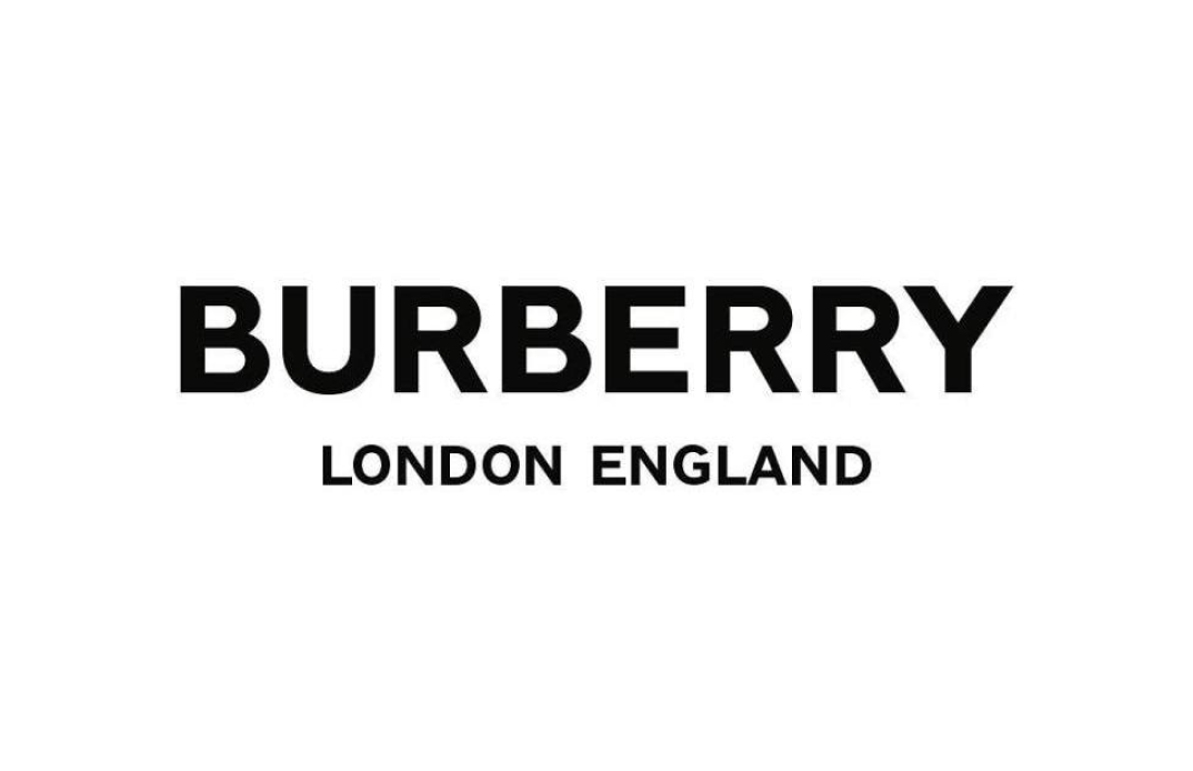
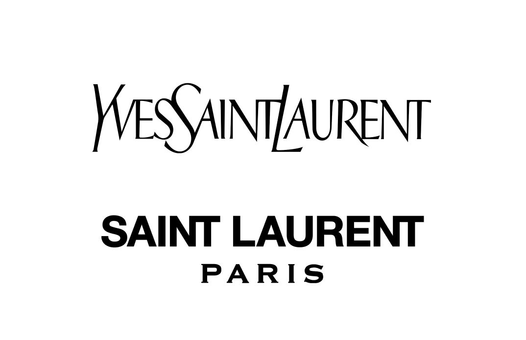
Use Sans Serif to Update & Attract Younger Demographics
In recent years, luxury brands are rebranding with sans serif logos to modernize themselves and attract younger followings. More and more companies are sporting minimalism and sans serif logos.
A clean sans serif with plenty of white space communicates simplicity, space(luxury), and boldness. It speaks to a younger audience, whether the sans serif is grotesque, geometric or humanist. Both Burberry and Saint Laurent took this route, and Hugo Boss recently rebranded again to attract genZ.
Future Design Trend…Maximalism?
The brand design trend is still primarily “less is more.” however, I think “more and more” is also on the horizon. Branding, design, and marketing are complex, interdisciplinary topics that vibe off many fields and subjects. With all the buzz on web3, things sure can get crazier.
If you enjoy this series, you can subscribe here: