

FontDiscovery 🖼️ 42: Font for Multilingual Support
This Week: a font that supports 800 languages, web typography, colors from Kunming, China

We are Hua and Wenting. We are building our saas app, Typogram, in public. In this blog, we share design resources for founders and stories about building our company!
I'm Hua, a designer and bootstrapping founder building Typogram, a brand design tool. As part of running Typogram, I create this digestible weekly guide with fonts, colors, and design ideas to help founders, creators, and makers step up their game in marketing and get creative!
Hi Everyone 👋
Hope you had a nice weekend! Last week I told you I started a new project, indiegrow. It has now been a week since launching and I have been having a lot of fun running it. I have shared two things with indiegrow subscribers: how to write a good comment for social media and three resources for startup founders. I thought I also let you know about it if that’s helpful.
On to our issue this week!
In This Issue
- Theme: Worldly 🌎
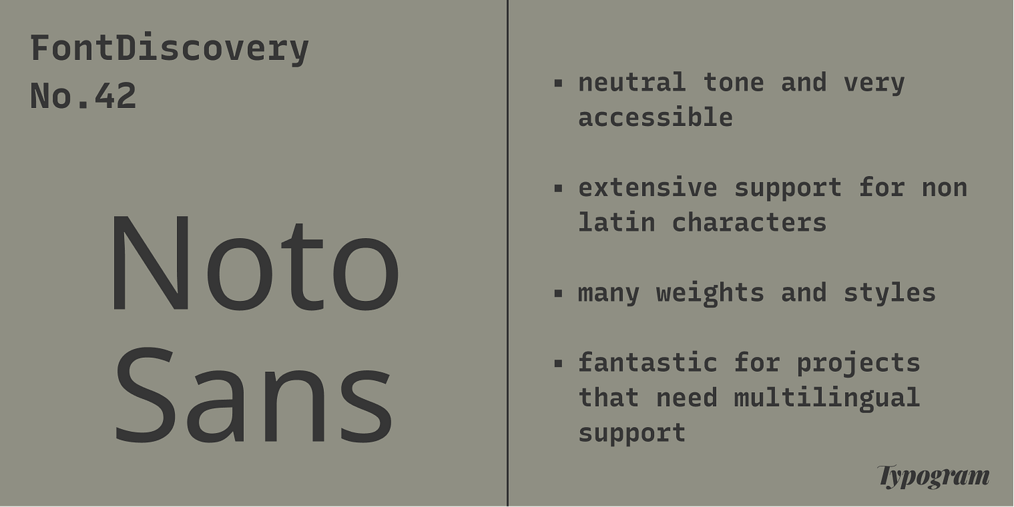
- Font of the Week: Noto Sans
- Design Idea of the Week: Web Typography
- Color Inspiration: Rock forest in Kunming, China
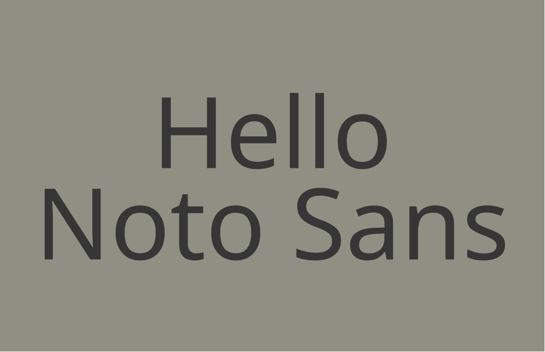
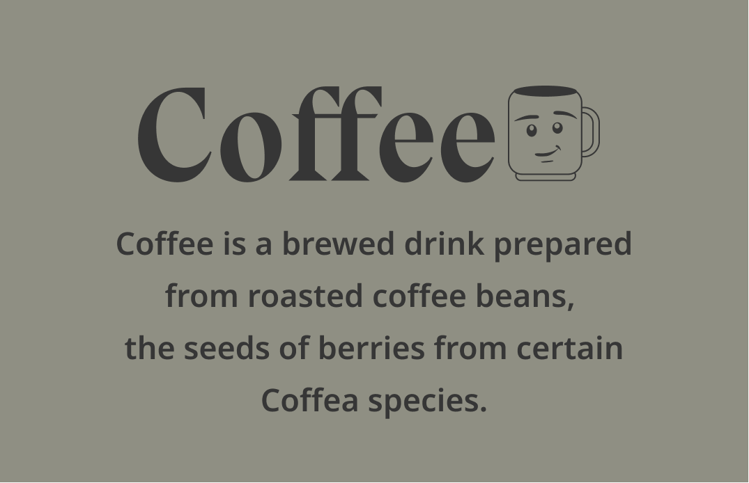
img: sample of Noto
Font of the Week
The Accessible Noto
Noto is one of my favorite open-sourced font family of all time due to its extensive language support. Noto is a joint project by Google, Adobe, and Monotype to eliminate “Tofu,” which is the box that shows up when there is a missing character. Noto has italic styles, multiple weights, and widths, 3,741 glyphs, and supports 800 languages.
For this newsletter, we will focus on Noto Sans, which is the sans serif, and in my opinion, the most useful for projects. Noto also has serif and monospaced versions. Both are fantastic for pairing and for projects as well.
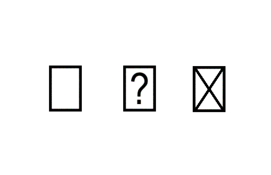
img: white square or “Tofu” happens when there are missing glyphs. source: quora
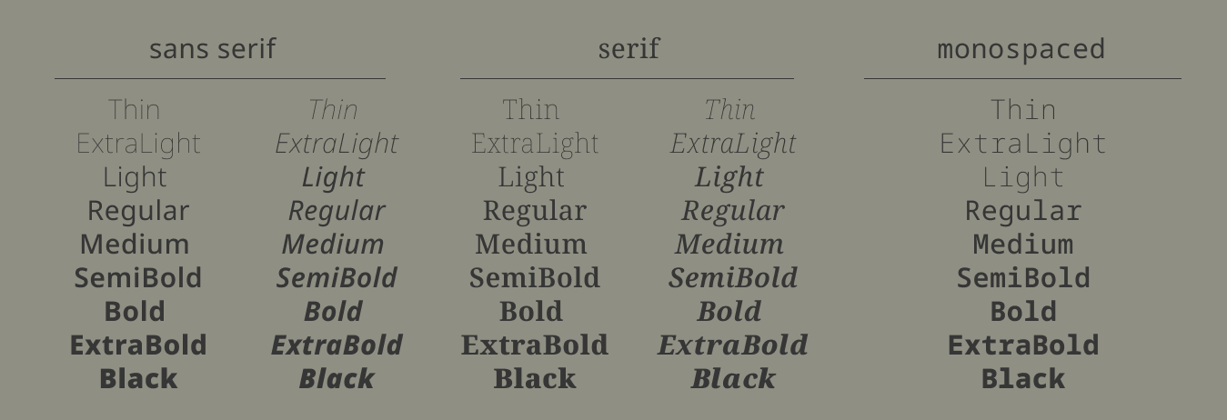
img: some styles of Noto family. Be sure to check out all the different languages
Font Detail
- Humanist Sans serif with calligraphy influence
- Support for numerous languages
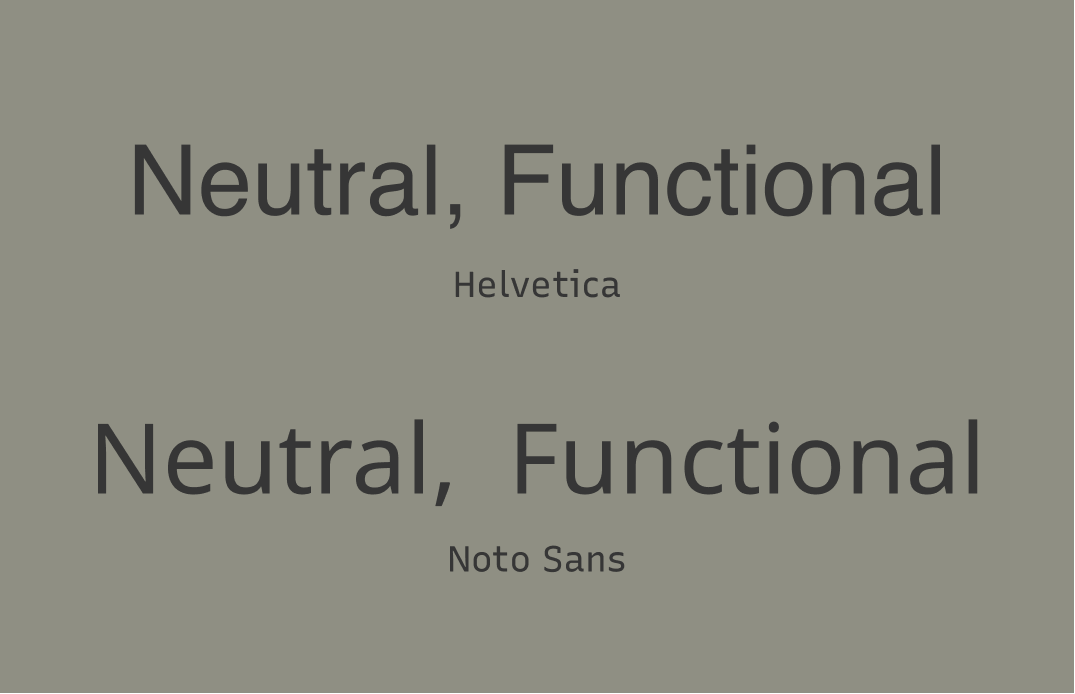
img: Noto sans comparing with Helvetica, another commonly used humanist sans serif
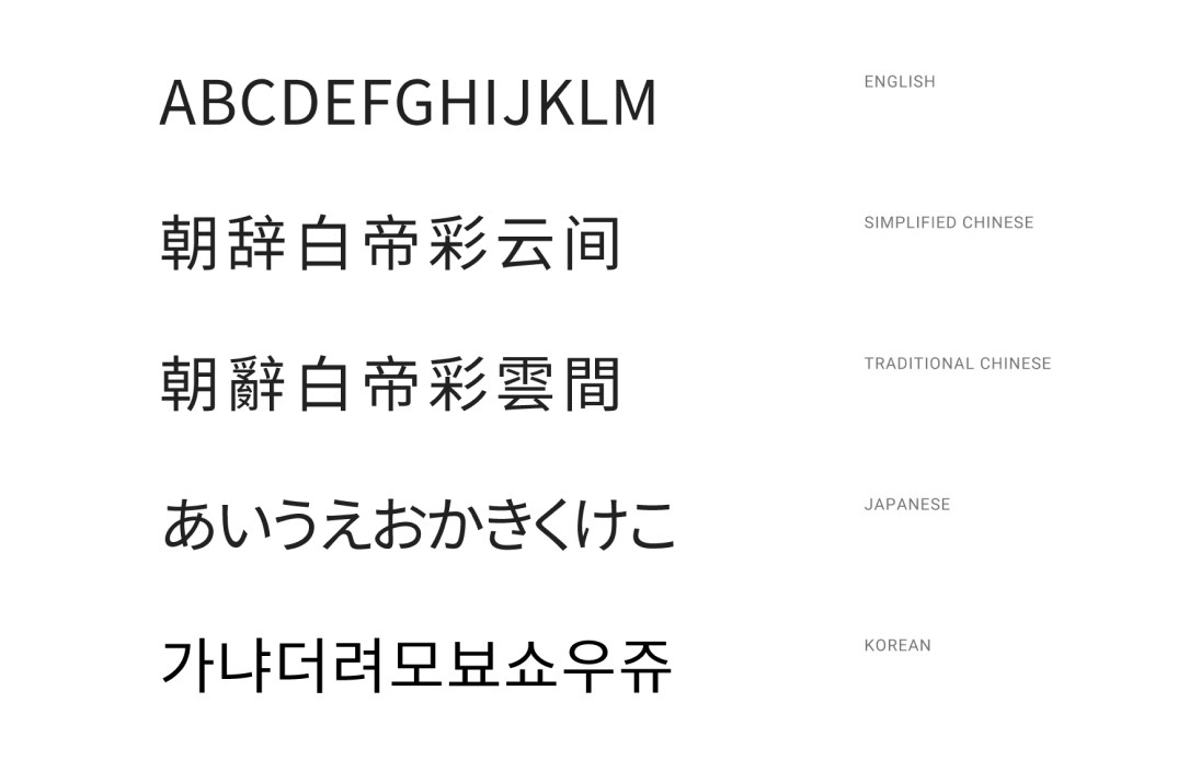
img: Noto language support, source: kevin’omalley
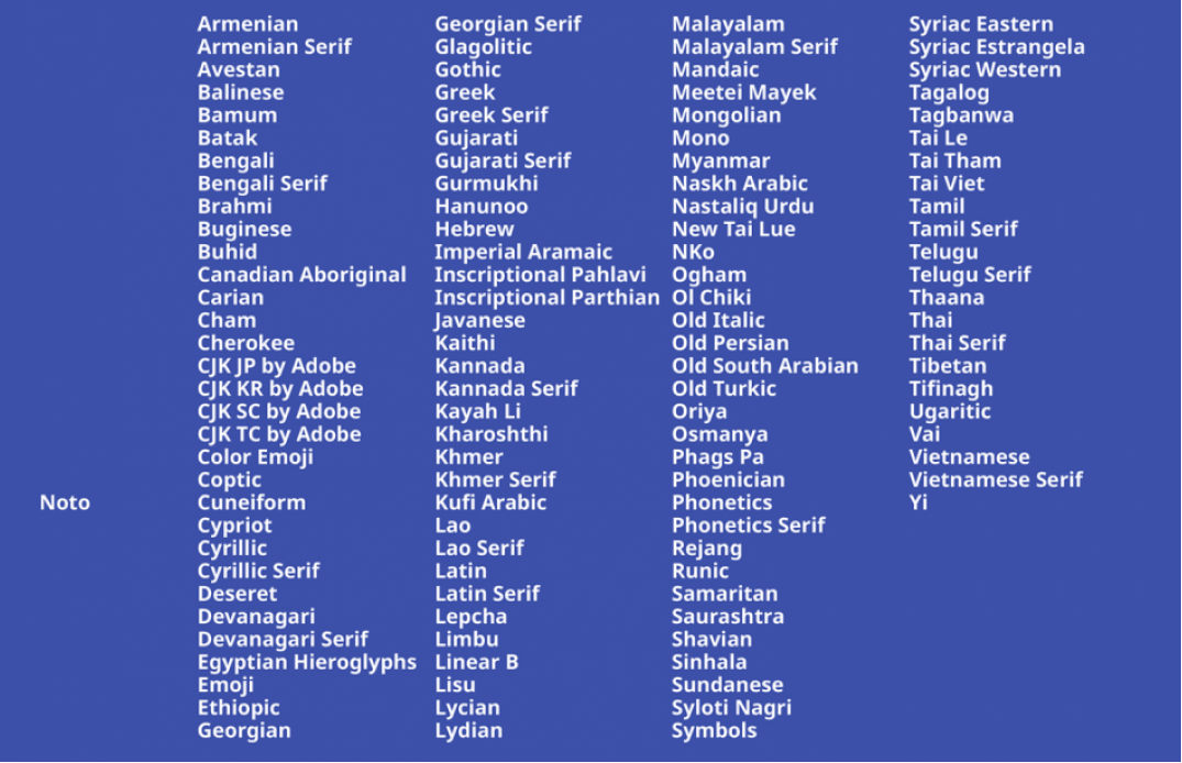
img: all the languages that Noto support; source: Monotype
How to use it for logo?
Noto Sans communicates openness and has a neutral tone. The bolder versions are great for logos. Avoid using Thin, Extra Light, or Light for logos, as they may be illegible in small sizes.
How to use it for marketing?
Noto support over 800 languages and you can find the Noto font of the language you need. Noto Sans has a neutral tone. If you want to be bolder, You can pair it with a decorative or flashy serif, like Playfair Display, or Bluu Next. It can also pair with Noto serif to stay neutral.
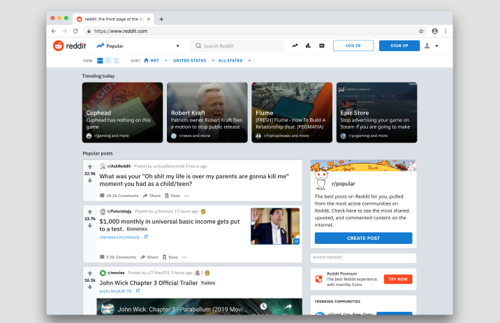
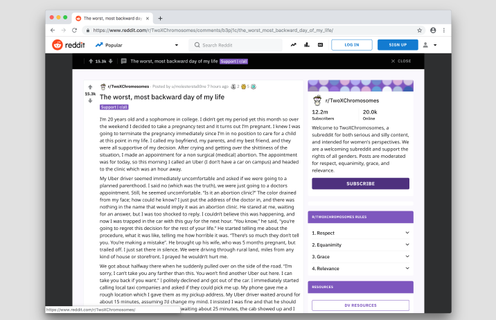
img: Reddit is a forum/ discussion site. The homepage uses IBM Plex Sans for the link titles and most of the interface. The body text of posts is set in Noto Sans. source: FontInUse
img: Noto sans pairing with Bluu Next
Design Idea of the Week
Web Typography Resources
Last week I received an email from a reader asking about web typography. I thought this might be a good chance to share some resources. These three articles do a great job explaining web typography fundamentals, as well as the granular details.
This one does a great job of giving an overview of what makes great web typography for your projects, like scale.
If you have time and want a more in-depth read, Prowebtype is a great resource that gets into the thorny technical details (with CSS snippets). It also has a chapter on variable fonts.
Typewolf’s Typography Cheatsheet
A handy little list that shows you shortcuts for special characters like curly quotes, accents, and other nice details, because what makes a project great is all those special little things.
Color Inspiration of the Week
Rock Forest in Kunming, China
Last week, UN’s Biodiversity conference took place in Kunming, China. Hope you enjoy the week with this amazing gift from nature with these calming, earthy colors.
Rock #8F8F83 | Rock Highlight #D3E2D9 | Rock Interior #DCB783 | Sand #E5D0A9
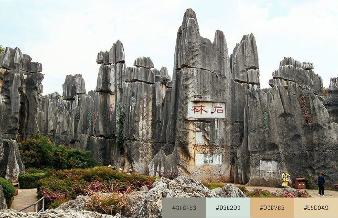
img: Kunming, China. source: allthatsinteresting
Typography Jargon Buster
Grotesque
seen around 1815
Grotesque sans serif got its name from the Italian word grottesco, meaning “belonging to the cave” because this sans serif had an overly simplistic appearance. Grotesque sans serif is the first generation of sans serifs, with a lot of weird (wonky) visual traits.
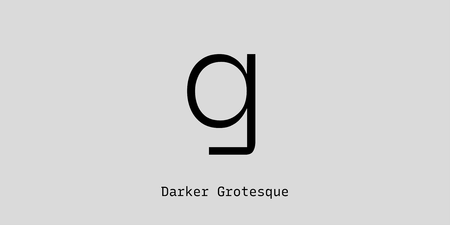
img: darker grotesque is an example of the funky grotesque sans serif
Creative Prompt
Try creating a social media graphic with Noto Sans!
Thank you!
Thanks for being hanging out here this week. Noto Sans is available here.
img: Noto sans infographic
If you enjoy this series, you can subscribe here:
Have more questions about design and fonts? Please email me hua@typogram.co or find me on Twitter at @HuaTweets. You can also read the past issues on Typogram's blog.


