

Debugging Is a Lonely Business

We are Hua and Wenting. We are building our saas app, Typogram, in public. In this blog, we share design resources for founders and stories about building our company!
While I was working towards my goal of producing a demo video of Typogram, I occasionally noticed a few cosmetic issues when I screen-record our app. I can’t help but fix them and re-record the video.
Before I dive in, I would love to provide some context. One of our app’s unique features is education. Both of our founders are professional designers by trade, and we wanted to share our design knowledge with users through our tool design. In Typogram app, we summarized our working methods of making a logo distinctive and bringing that to users in a mix of educational content and matching tools to help users:
- firstly, come up with unique and brilliant design ideas
- secondly, execute those ideas with ease
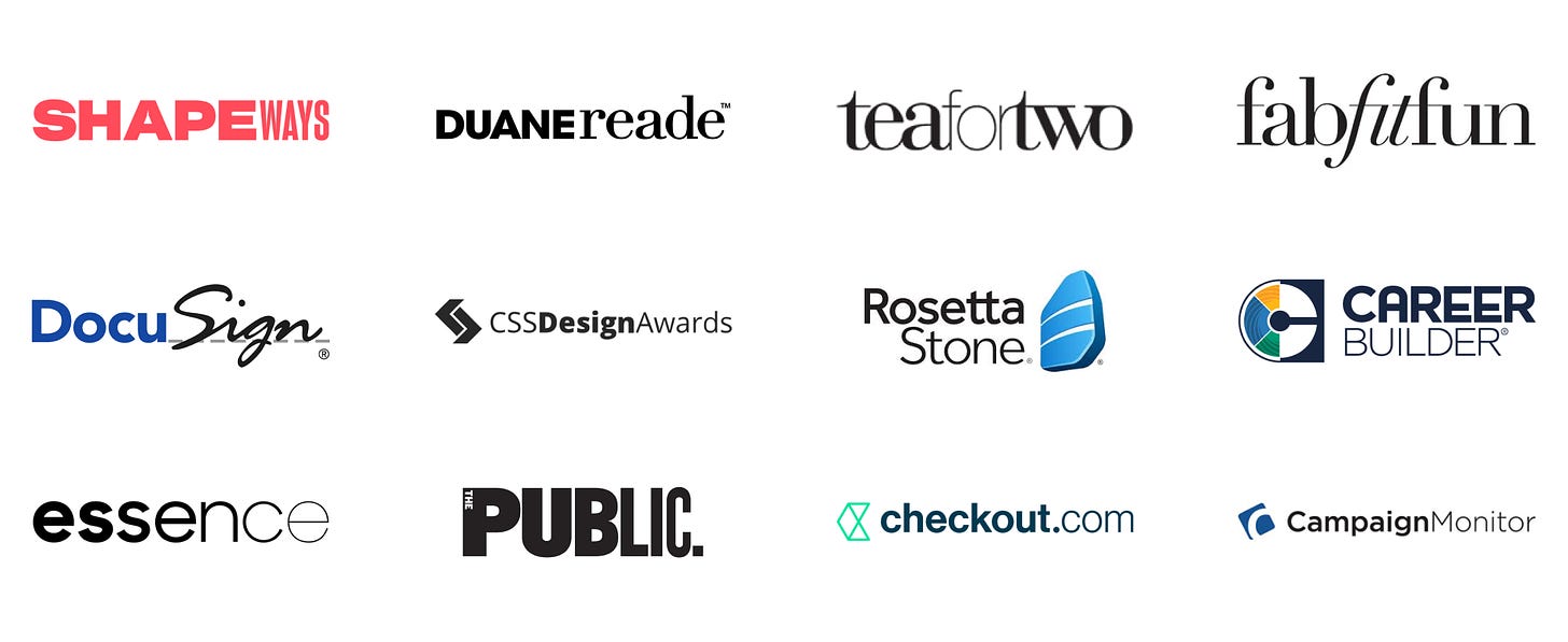
One of these logo design methods is called “font style mashup.” It mashes up two or more font styles together in one logomark. If we pay attention to successful brands around us, logos with “font style mashup” is everywhere:
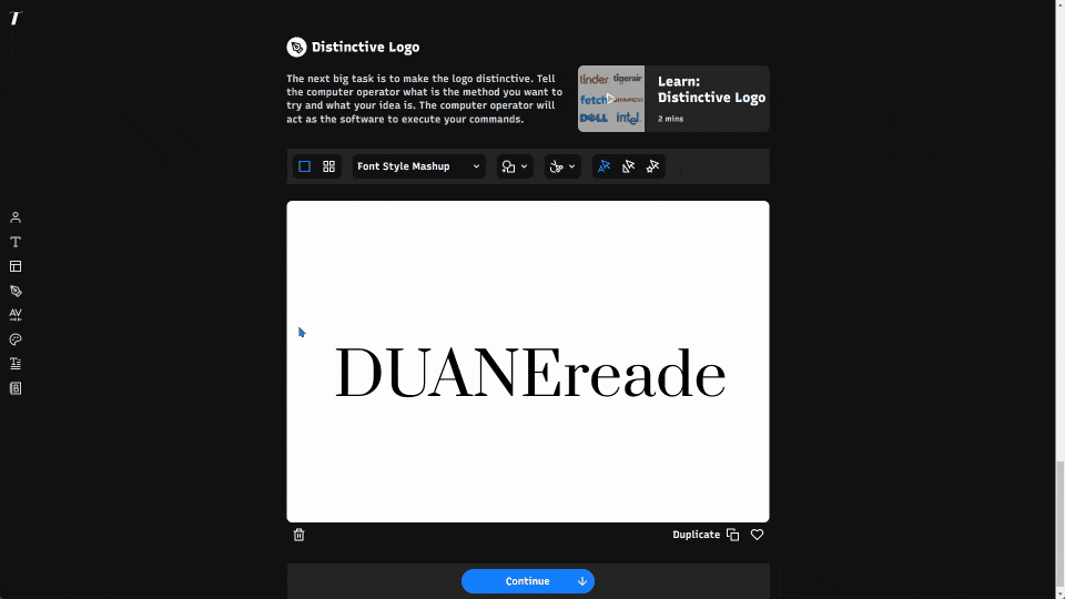
In my first attempt to record a demo video of the font style mashup method, I noticed that while the logo was initially centered on the canvas, after I adjusted the font size, it became left-aligned which is less desirable.
Before improvement, logomark is not centered after font size change
I switched to debug mode and figured out how to dynamically center the logomark after every edit, and then re-recorded the video:
After improvement, logomark is always centered

Then I moved on to record the next feature/method, which is “Irregular Letters.” This method makes one of the letters stand out by sticking their toes outside of the box, figuratively speaking, to leave a long-lasting impression. People tend to notice the irregularities from regularity; we can utilize this human nature to our benefit in branding.
To achieve the irregularity, we can flip one letter:
Before improvement, logomark is not centered vertically

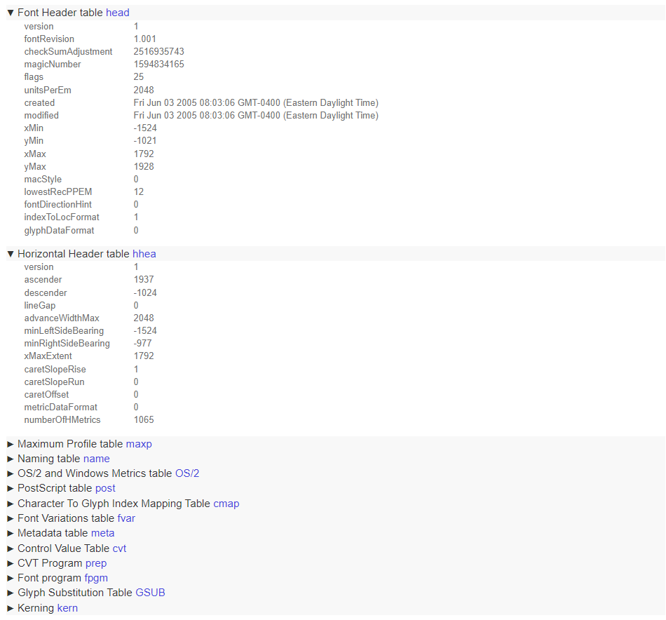
I again noticed the logo is not centered vertically on the canvas. This bug turned out to be much messier because it has something to do with font metrics data from font files:
Can you believe I spent an entire workday scrubbing through the font metrics logic and finding the solution? I felt really happy after I finally fixed the bug and gained a stronger understanding of desktop font rendering, but I had a hard time sharing that joy — it is rather hard to explain, and it seems so trivial of an improvement, hardly noticeable at first glance:
After improvement, logomark is centered vertically

I find debugging a very lonely business. Often, we are working alone on a bug, knee-deep in noodle-like logic, scratching our hair off; and after we finish, we would have to explain to others what the issue was to begin with before we get into what was fixed or improved.
The bug today is at least a little better because it is visual; the non-visual bugs make me feel even lonelier. However, at the end of the day, I am still happy that the product got better, and I learned something new in the process.
If you are a programmer, do you feel this way when you debug? If you are not a programmer, do you have similar feelings about the things that you do? Let me know!
❧
If you enjoy this series, you can subscribe here:


