


If you enjoy this series, you can subscribe to our blog updates:
Hey Everyone!
Hope you had a fantastic weekend!
Welcome to another issue of Typogram’s branding series. In previous posts, we talked about Facebook's rebrands and Tech Logos. Just recently, another Meta company, Instagram, rebranded. This week, let’s dig into Instagram’s brand history and analyze its new rebrand (or should we say “visual refresh”). As always, please let me know what you think!
A Quick Look into Instagram’s Brand History
Skeuomorphism & Post-Skeuomorphism
Like its brother of the same Meta father, Instagram also had its deep share of controversies. From its effect on mental health in teens to how it deals with privacy and data. But unlike its big brother, who flirted with numerous instances of rebranding, Instagram's branding history had only two clear and significant phases: Skeuomorphism and Post-Skeumorphism (Flat 2D).
Skeuomorphism is a design trend where designs have cues mimicking their real-life counterparts. It was popular in the 2000s and used everywhere. Instagram's early logos were Skeuomorphism logos.
The original founder, Kevin Systrom had created the first iteration of the Instagram logo before asking help from a designer to simplify and turn it into the more recognizable polaroid camera logo. The skeuomorphic polaroid camera logo became an insta-classic. (get it?)
img: A blast from the past - Transition from Skeuomorphism iOS 6 to flat 2D iOS7 in 2013 update. Source: Medium
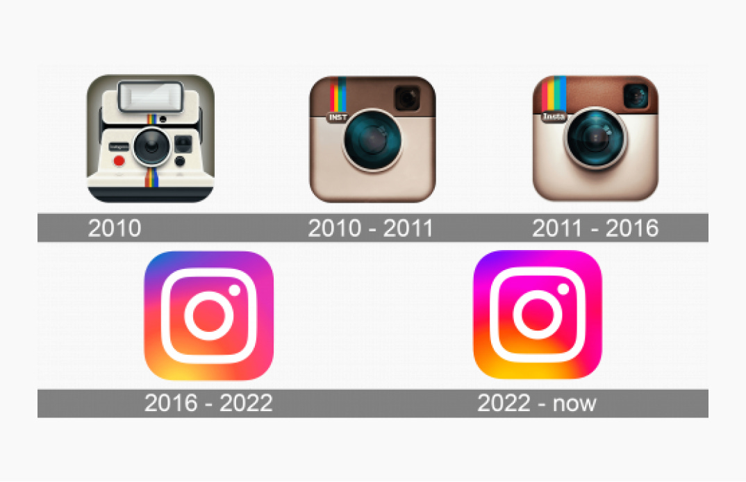
img: Instagram logo tweaks. source: 1000logos
In 2016, Instagram rebranded to the design we know today. It shocked the world with the sudden transformation from an iconic Skeuomorphism logo into a minimalist flat 2d icon. Though it was time for Instagram to rebrand, most people weren't ready to let go of the iconic Skeuomorphism logo. Perhaps that's why Instagram launched a muted “visual refresh” this time rather than a total rebrand. Using its wisdom from a hard-learned lesson, Instagram is carefully testing out the water.
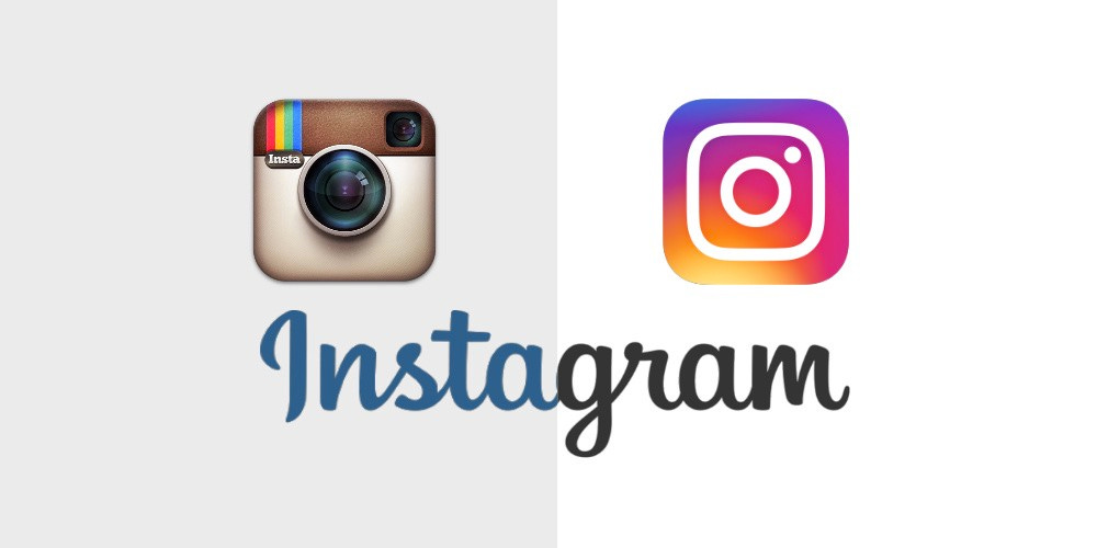
img: Instagram branding’s drastic change in 2016. Source: Medium
The "Visual Refresh" Rebrand
In this rebrand, Instagram focused on updating three parts:
- Fonts
- Brand Color (Gradient)
- Layout
Let's look at each of these parts closely.
A New Brand Font
A significant update for Instagram's rebrand this time is a brand new, custom brand typeface, Instagram Sans, which includes three styles:
- Instagram Sans Regular – A friendly sans serif for small text and paragraphs
- Instagram Sans Headline – A more flavorful, quirky display font with script influences, a homage to Instagram's logo from the Skeuomorphism period.
- Instagram Sans Condensed–The narrow-width alternative to Instagram Sans Regular
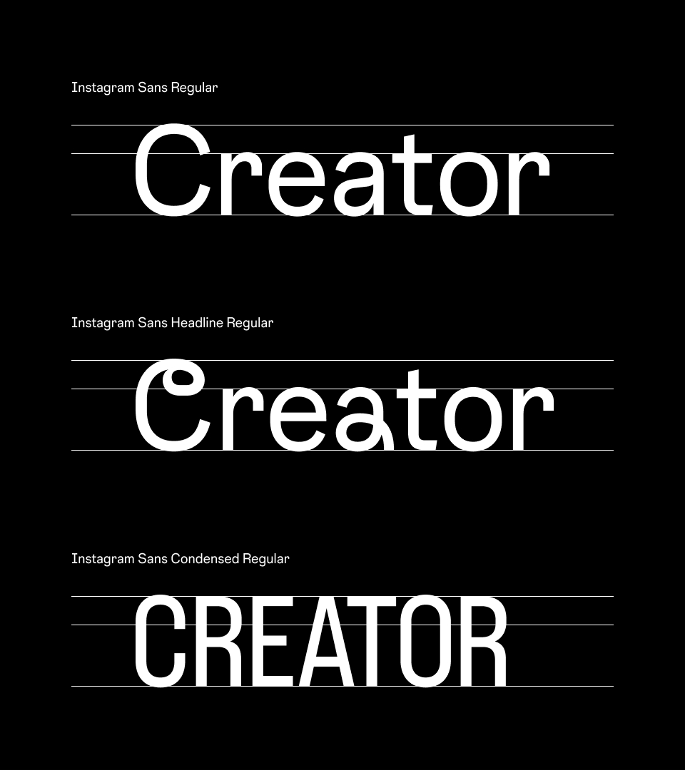
img: Instagram Sans Family. source: instagram
Visually, Instagram Sans is friendly, geometric with script influence – A rare aesthetic combination of geometric ideals and man-made calligraphic characters. The in-between circle and rectangle geometric shapes are found throughout the letter forms. This intentional style choice is based on the "squircle," the rounded rectangle in the logo, part of Instagram's brand DNA.
Upon the first look, I like Instagram Sans. I was pleased to find out that the same designer created Space Mono, a font we reviewed previously. As a brand font, Instagram Sans feels unique and personal with its eclectic combination of geometric and human-style characters. I think it did justice to a social media app looking to invite users to share their lives. At the same time, the script influence nodded to the app's brand history.
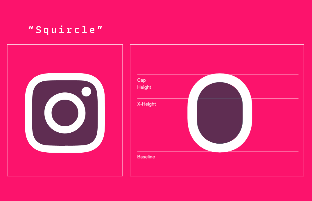
img: Instagram’s squircle
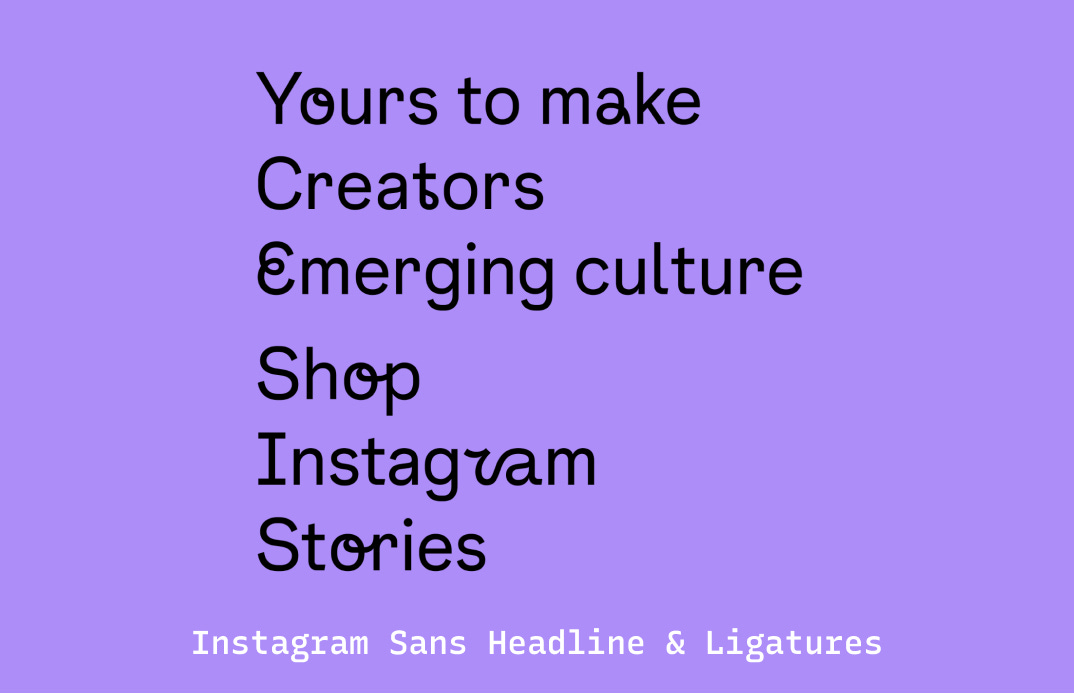
img: Beautiful script details in Instagram sans, especially in theligatures
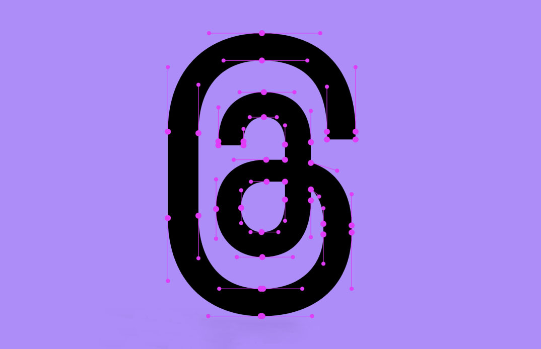
img: More script details
Brand Gradient Refresh
In the Post-Skeuomorphism era, the magenta/orange/yellow/purple/blue gradient became the most recognizable part of Instagram. The gradient's usage was limited and mainly on an alternate logo and as a visual cue and highlight. This is what the head of design said about the use of colors in 2016 rebrand:
While the icon is a colorful doorway into the Instagram app, once inside the app, we believe the color should come directly from the community's photos and videos.
— Ian Spalter, Head of Design, Instagram
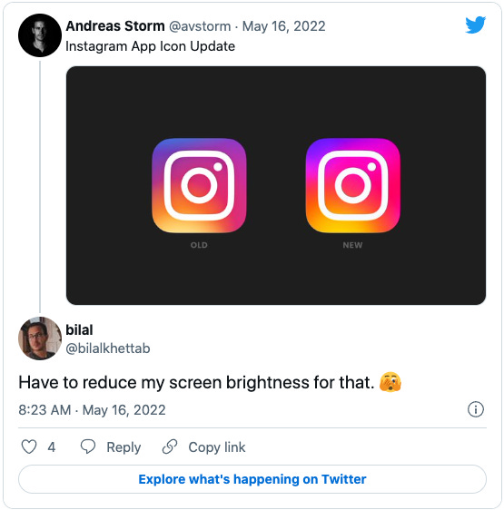
In this current rebrand, Instagram updated its gradient. While the gradient still rests on the same color spectrums, Instagram tweaked the brightness and added more "fluidity" to the colors. It also plans to expand the gradient's usage to "3D" spaces –– exactly how Instagram plans to use the fluid gradient in new ways will be a mystery that unravels itself in due time.
Meanwhile, the brightness of the gradient is attracting attention, unfortunately, not the good kind.
Community Centric Layout
Our layouts mirror the app: confident and simple, placing community and content at the forefront.
Layout is a more exciting aspect to me than the gradient. With this update, Instagram pushes out a more fluid grid system for content. It's no longer sticking to square, but in portrait and landscape too, and sizes in between. There is also a rumor: Instagram is adopting a full-screen content feed similar to Tiktok's "for your interest" feed when users initially enter the app - how the new grid will play out in this will be interesting.
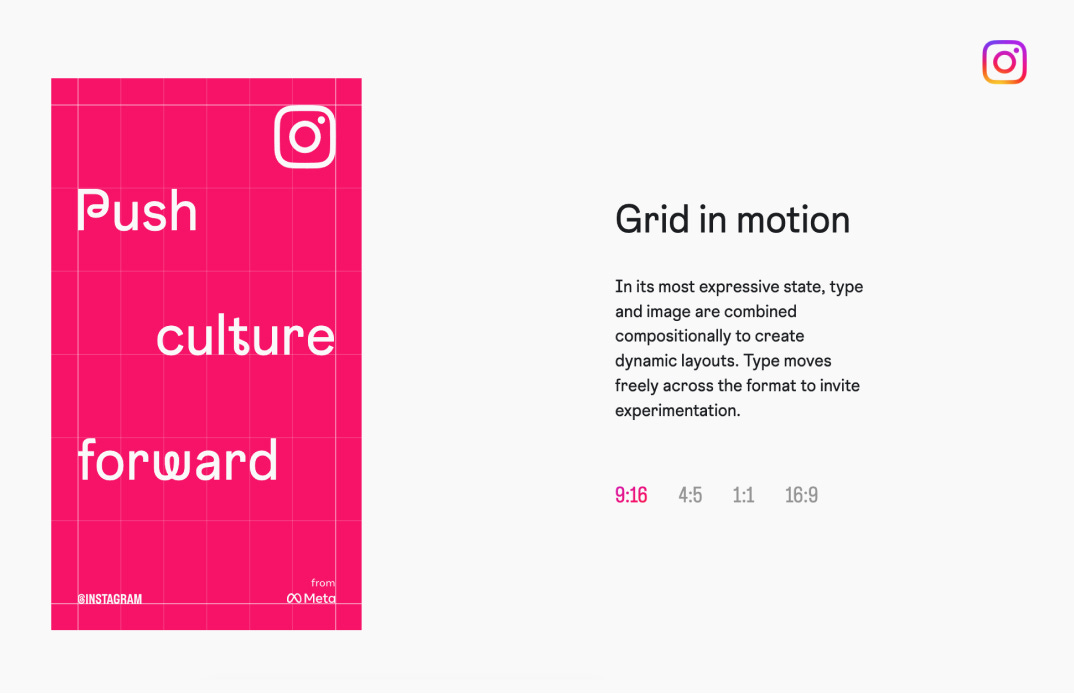
img: Instagram’s new plans for grid
Eye of the Beholder?
For social media apps, the competition for attention is fierce out there. To many users, Instagram is no longer the apple of the eye – that throne now belongs to Tiktok, the more "authentic" app with rapid growth.
In general, when companies don't feel comfortable with making an immediate change to their brands, they do a "visual refresh" - small changes that can be incremental.
In the end, I think this update was successful because it generated enough buzz without making too much change to Instagram's branding. With this visual refresh, Instagram might be slowly rolling out more small visual updates in the future - perhaps following the footsteps of Facebook, the big brother. We'll see.
That’s it for our branding series this week! Missing normal FontDisovery? Check out Issue 18, League Script!